Beautifully described by content marketer, Ali Neilly "When an iconic company announces a rebrand, the design world waits in eager anticipation.
Why? Because we know a rebrand isn't simply a shiny new logo. It involves a strategic overhaul that can completely transform public perception. For better or worse!
Change can be surprising and divisive—especially if it is a brand you already know and love. Will it be an evolution or a revolution? How will the logo change? What about the typography? Moreover, how will the colour palette tie in with everything else? It's all very exciting".
Established in 1936, Aer Lingus is one of the most liked and best-regarded international airlines, and yes 'you guessed it' they have just unveiled a refreshed branding across the board.
Verdict? A brilliant stroke!
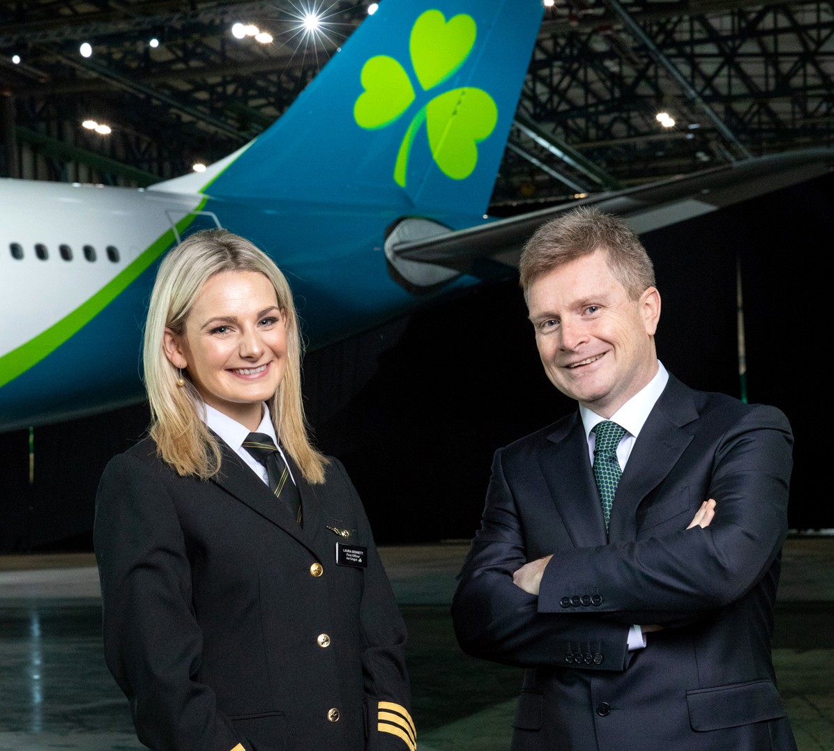
The updated logo and aircraft livery has been superbly crafted to reflect the airline's position as a modern and contemporary Irish brand.
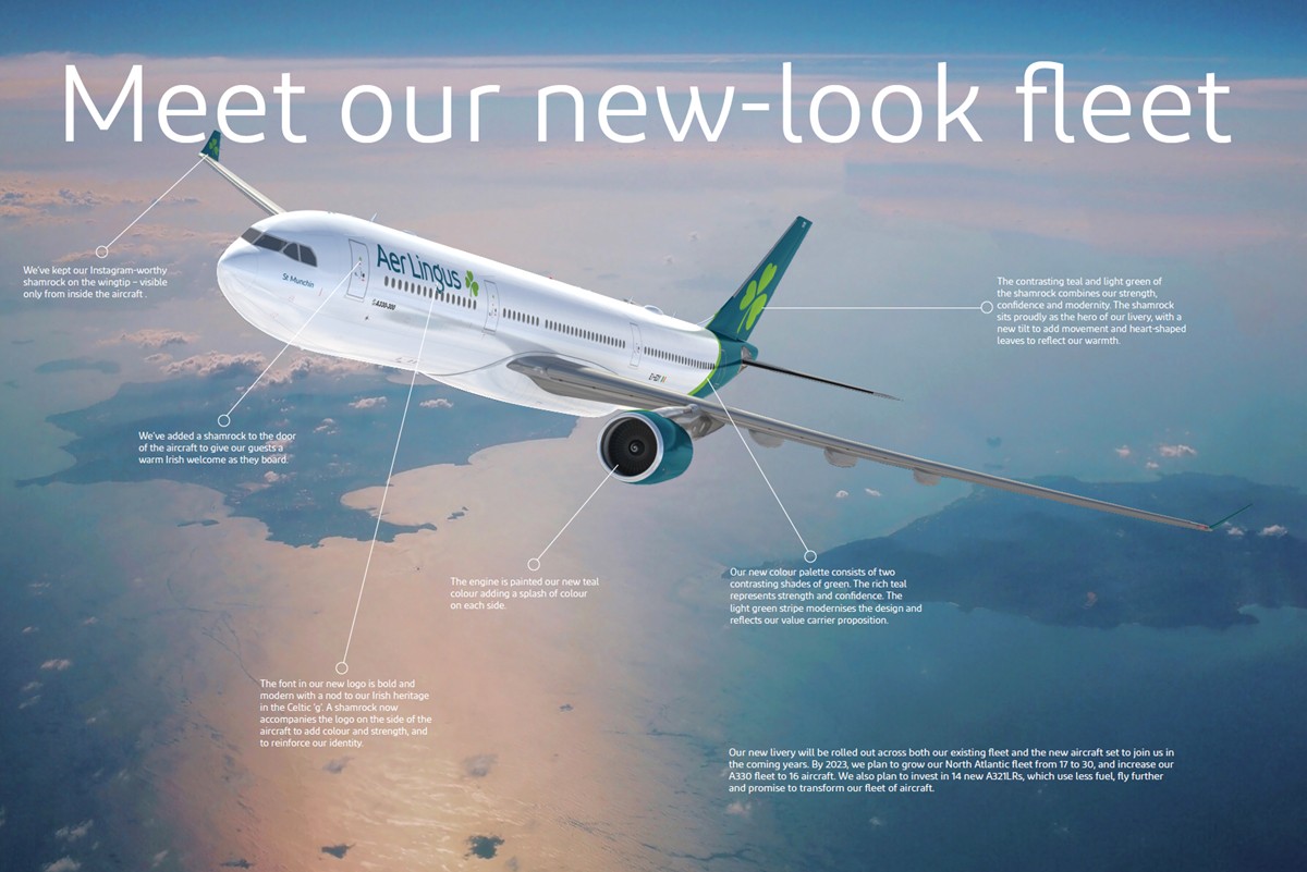
The new logo wisely retains but restyles the iconic shamrock, adding a tilt to symbolise dynamism and speed, with heart-shaped leaves reflecting the warmth and hospitality of the brand. Guests will see four shamrocks on the new Aer Lingus aircraft livery. The first is within the new logo, the second sits on the tailfin, a third welcomes guests at the door, and a final surprise on the wingtip is in prime position for capturing on social media.
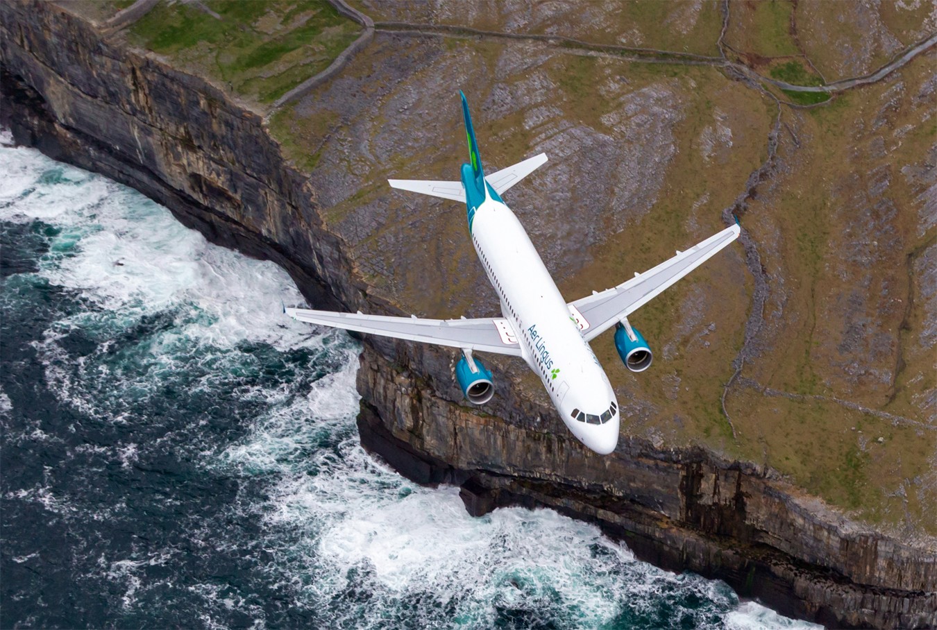
The Aer Lingus logo font has changed to 'Diodrum' and the dominant colour is teal. The body of the new look Aer Lingus aircraft will be white with a teal-coloured tail and engines, bringing a sleek, contemporary feel to the design. The teal undercarriage means that Aer Lingus will be instantly recognisable to those on the ground. The brand refresh is currently being rolled out across all brand platforms, with a new website design and new app design. It will be visible across all guest touchpoints, from check-in to boarding gate and on to the aircraft.




Comments (0)
Write your comment below